|
Throughout this course this semester, I have learned a lot of important skills and information. I have been able to learn many different painting styles, including watercolor, acrylic painting, and oil painting. Before this class, I mostly stuck to drawing and was not super comfortable with painting. However, I feel that I have been able to apply the techniques and information I learned from this class into my artwork to improve my painting and try out new mediums. I also enjoyed having interesting critiques with my classmates, who always had nice compliments and helpful advice/critiques for my paintings that helped me to improve. Overall, I feel that I have learned a lot to help myself become a better artist, as well as gained experience trying out different styles of art.
0 Comments
Brainstorming/references  Color sketch/in-progress      Self Assessment Questions
1. I think that my piece is neat and well executed. I believe that my lines are clean and that there is a good separations between the cat and the background. 2. I use color by incorporating a lot of blacks, whites, greys, and browns, as well as a pop of yellow in the background. The eyes also stand out because of their greenish/yellow color. I used texture to show the details of the fur. I used space to put emphasis on the cat by having it take up most of the space on the canvas. 3. My subject matter is my cat, Seamus. I decided to choose him for this painting because I wanted to be able to show all of the unique details of a cat on a large canvas. 4. The emphasis of my painting is the cat. I accomplished this by not putting anything else in the background besides a color gradient to focus on the cat. 5. I used texture to create the fine hair and fur details on the cat's face and body. 6. By looking at different animals I was interested in painting, I was able to decide which animal I was most interested in painting. I think that my painting was successful because I believe it shows an accurate portrayal of the photo I took of my cat. 7. I liked using oil paint as a medium, but I also had some issues with it. Compared to acrylic paint, oil paint dries really slow, which made it harder to add details and add fur without it blending into the painting. However, it would've been harder to create this piece with a medium like watercolor because it's harder to show details. 8. Some difficulties I had were getting the colors right without blending them together and showing the details of the fur. I also had trouble initially sketching out the cat on the canvas because it was too big, so I decided to make the cat slightly smaller and take up less of the canvas space. If I were to make changes, I would try to do a more complex background and fix a lot of the little details that were difficult to show. Brainstorming/references  Progress/Reference/Color sketch      Final Painting  Self Evaluation Questions
1. I believe that my piece is neat and well executed. If I were to make it neater, I wish some of my lines on the buildings/windows had been straighter and cleaner. 2. I used a mix of cool and warm colors for this piece, but used colors that felt more mellow instead of really bright or really dark colors. I feel that this allowed the piece to give off a more upbeat/summery tone. 3. I created contrast in my painting by using different light and dark colors that varied from each other. You can see this in the trees and in the buildings particularly. 4. I used textures a lot while creating the trees. I wanted the trees to be wispy and reflect the look of the Spanish moss trees in Savannah, Georgia. 4 & 5. I used highlights and shadows all throughout the piece to show the depth of the street and the features in the painting. 6. One painting technique that helped me the most was while the paint from the sky was still slightly wet, I would go in with the green for the trees and create downward brush strokes to create the Spanish moss look on the trees. This made a really nice look on the trees, almost so you can see the sky in the background. 7. Some of the difficulties I had were doing the crosswalk and details with the buildings. I also had trouble doing some parts of the painting because it took a while for the oil paint to dry. 8. Some of the successes I had with this painting were creating the sky and the trees. I really like how both of these features turned out in the painting.  For this assignment, I painted an apple using a palette knife. Because this was my first time palette knife painting, there are a lot of things that could improve in this painting, but I started to learn how to paint using this technique.
 For this assignment, I mixed the primary color oil paints to create 100 different colors. This helped me understand how different colors mix with each other, and how the different paints vary from each other.
For this assignment, I practiced using oil paints by painting a turtle. I practiced mixing colors and blending on the canvas with this new medium.  Final Painting  Brainstorming Ideas  Reference photos/compositional sketches 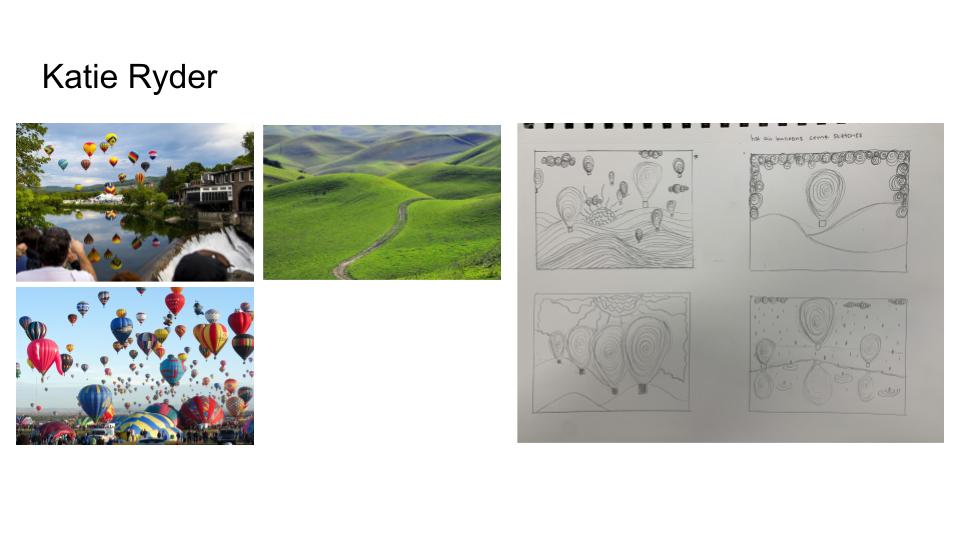 Final Color Sketch  In-Progress Photos Self-Evaluation Questions
1. I think that my piece exhibits good craftsmanship, I think that I used neat and clean lines and that it turned out well. I think that there are some parts of my piece that I could have executed in a neater way, but overall, I think it came out good. 2. I think that my piece shows Hundertwasser's style through a childlike style with spirals and many different colors. Many of Hundertwasser's pieces have abstract elements that contribute to the meaning of the piece, which I wish I incorporated more of, however I believe that I was able to capture the way he displays a childlike look throughout his paintings. 3. I decided to go with a very lighthearted color scheme that uses a wide array of colors. The sky consists of mostly warm colors, while the hills are cool colors. I used various shades of the same color in many parts of my piece to show the transition of colors in the hills and the sunrays. I also used gradients in the hot air balloons, as well as incorporating silver and gold sharpie throughout the piece. 4. I think the focal point of my painting is the sun, since it is the center point of the piece. I think the sun rays expanding to the borders of the piece help draw the viewer's eye to the hot air balloons and the hills. 5. I used lots of pattern in this piece to show a smooth transition of colors. I used the same curved-line pattern on the hills, as well as curvy lines for the sun rays. I also used gradients in the hot air balloons and the sun. I used spirals and dots in the hot air balloons to add patterns with the sharpies. 6. I used spirals in the hot air balloons in my piece. I think they enhance my painting by making the hot air balloons stand out more and by making them more unique. 7. One difficulty I had was time, as I ran out of time towards the end of the project and had to rush a little bit. I also had trouble with some of the colors because of the red wash on the canvas. It took many layers for the greens and darker colors to show up. 8. It was important to plan and revise my sketches to come up with new ideas for my piece, decide what colors I wanted to use, and decide where I wanted to place elements in my piece. 9. I can use my knowledge from this project to improve my acrylic painting artwork in the future. I learned how to create colors from the different acrylic primary colors and had lots of practice with this medium. In-progress photos    Reference photos/compositional sketches 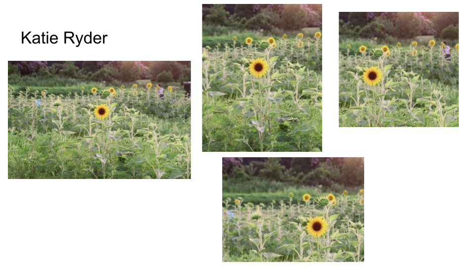 Final painting  1. In my painting, I used the wet on wet and dry brush watercolor techniques. I think this helped my painting by adding different details and textures.
2. I think using transparent layers was very important. For some of my painting, I started too dark, which ended up not looking as nice as when I used transparent layers. It is easier to create the look you want by gradually building up with transparent layers. 3. I think that my composition was successful. I used the rule of thirds to place the sunflower in a pleasing position. I created a foreground, middle ground, and background and used contrasting values. 4. I think color choice was very important to add to the realism and details of the painting. I think that some of my color choices were good, but I think I could've chosen some different greens and blues to add more to the painting. 5. I think that my craftsmanship was pretty good. I tried to add detail and different values in my painting. I think I could've worked on making a neater and cleaner image, as well as creating a stronger horizon line. 6. If I were able to do something different, I would make sure to start in more transparent layers and choose some different colors. I think doing this would've made my painting more realistic and more detailed. 7. Through this unit and project, I have learned more about watercolor techniques and painting with layers. This project was really tough for me, as watercolor allows little room for fixing your mistakes. Overall, I think it challenged me and helped teach me more about watercolor. 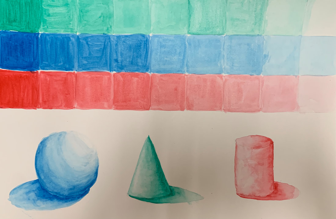 For this assignment, I used watercolors to create three watercolor scales and three forms: a sphere, a cone, and a cylinder. I used my knowledge of shadows and highlights to give the forms a three dimensional look.
|
Archives
December 2021
Categories |


 RSS Feed
