|
As the semester comes to a close, I feel that I have learned a lot of valuable information throughout this class. I have learned new techniques and skills that have helped me become a better artist. When I first started this class, I knew that I definitely liked drawing better than other art styles, but I felt like I still had a lot to learn/improve upon. After doing assignments and projects practicing contour line pen drawing, graphite drawing, colored pencil drawing, and drawing with pastels, I feel that I have been able to expand my art knowledge and enjoy new methods of drawing. I have been able to complete drawings in this class and in my free time that I never thought I would be able to accomplish before this class. Overall, I feel that I have gained so much experience doing different types of drawing and have learned so much that I can continue to use while creating future drawings. Some of my favorite pieces that I have done in and out of class from this semester are below.   
0 Comments
Brainstorming  Color sketch/reference photo/in progress photos       Final Self Portrait 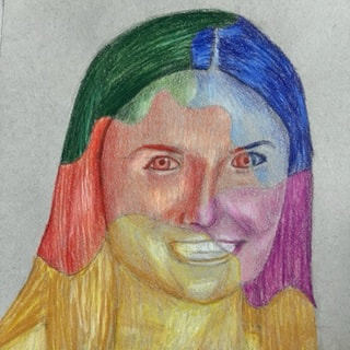 Self Assessment Questions
1. To complete this project, I went through a process of brainstorming ideas, finding a reference photo, creating a sketch of what I wanted the piece to look like, and finally working on my final portrait of myself. I chose to use Prisma colored pencils because I wanted to represent the different sections of my face in different colors. 2. I chose to do a regular portrait of myself, while also using different colors to do something unique. I decided to break up my face into different sections using swirly lines. I then decided that each section would be a different color, and I could still show dark and light values in my face using different shades of those colors. 3. I believe that I did achieve a full range of value in my portrait. With each of the different colors, I looked at the highlights and shadows on my face and hair and used different shades to create those values. 4. I believe that my artwork is neat and well crafted. One thing that could've made it a little bit neater is if I was able to erase more of the pencil that you can see through the colored pencil. 5. I was able to capture my look by carefully making sure the features of my face matched up with my reference photo. I also made sure my shading matched the reference photo. 6. When I started to draw my face for this project, I noticed that some of my features seemed to differ slightly from the standard proportions used while drawing faces. So, I decided to use a grid system to map out my face. I placed a 3x3 grid over my reference photo, and drew the same grid onto my paper. On my paper, I also marked the half way point in each individual line in each grid box. This helped me accurately place my features onto the paper because I could see the same grid on my reference photo. 7. Learning how to draw all the features individually was helpful because I was able to better understand where the values in all of those features go and how they all contribute to the whole portrait. 8. I think that practicing drawing my own face was very helpful because it helped me to have practice drawing my own face. My first practice portrait that I drew of myself was not very good, but it was beneficial to learn from that and see how I could improve. 9. Some obstacles I had included running low on time, not erasing enough pencil in some areas on my drawing, and making sure that all of the color's values aligned with each other while transitioning sections.       For this assignment, I practiced drawing different facial features. I did my own features, as well as practicing other features from tutorials.
Above are practice drawings that I did in 1, 2, and 3 point perspective. This assignment was helpful to allow me to learn how to draw in different perspectives to create more realistic drawings.
Brainstorming Ideas  Reference photos/compositional sketches       In-Progress Photos   Final Drawing  Self Assessment Questions
1. I think that I have pretty good craftsmanship in my drawing, as the colors are saturated and are neat. I think that some of mines could have been a little cleaner, but besides that, I think it is executed neatly. 2. To create the look of transparency, I used lots of white highlights on the cake platter and colored it a light layer of white to show the difference between the glass and the background. Even though there is white, you can still see the cake, table, and wall through it. 3. I decided to use a lot of browns throughout my piece to show the cake frosting, cake, and the table. I also used a yellowy-pink in the background to make the cake pop out, and to show highlights in the cake dish. 4. I created contrast in my piece by using dark colors for the table, lighter colors for the wall, and sharp whites for the highlights in the cake platter. 5. I used highlights and shadows to show the details in the cake platter. I used a mix of grays and whites to show how the glass reflects light and its transparency. I also used a shadow on the table to show the placement of the cake platter with the light source. 6. It was very important to understand how to layer Prisma colors for this piece. I found it helpful to know how to mix colors and create highlights using colored pencils. The mini assignments were helpful for me to practice drawing transparent items and blending using colored pencils. 7. One difficulty I had was blending the colors in the cake platter. I feel that some of the grays did not blend how I would've liked them to, and some colors on the cake did not blend as I well as I hoped for either. If I were to redo this piece, I would like to add more detail to the cake platter/fix its shape and work on creating a more complex background. Brainstorming Ideas  Compositional Sketches  In Progress    Final Drawing  Self Reflection Questions
1. I think that I was able to create an interesting point of view. I used foreshortening to show the dog jumping off of the dock towards the viewer of the piece. 2. I think that it was important to learn drawing in perspective before completing this piece. For example, I used 1 point perspective to show the dock in my drawing, so it was important to understand how one point perspective worked before doing this. 3. It is important to understand drawing in perspective to be able to accurately show different objects in a drawing. Without perspective in many pieces, it is difficult to achieve the sense of realism and show an accurate portrayal of what you are drawing. 4. Practicing different colored pencil exercises was important to understanding how to blend colors and create the colors that I wanted. It was also helpful for me to understand layering and how the piece comes together through several layers of colored pencils. 5. I think that I used good craftsmanship throughout this piece. I think that my use of colored pencil is very neat and that I saturated my colors well. I think that the background could use some more work, but I like how I was able to create the look of the dog jumping. 6. I think I was able to show depth. I used 1 point perspective to show the dock going off into the distance, as well as using foreshortening to show the dog jumping. I used shadows as well to show to depth of the dog. 7. Personally, I really enjoy drawing with colored pencils. One obstacle I have is creating enough layers to show the saturation of the colors in the piece. It's also very hard to erase colored pencils, so it can be hard to fix your mistakes. However, the Prisma color pencils are super nice to blend and use in a piece like this. 8. I think it would've been nice to have more practice drawing dog fur, although I think I did a pretty good job for not having much experience drawing dog fur. I also wish I worked more on the background and figured out a way to add more detail.   For this assignment, I drew a ribbon, spheres, and a value chart in white colored pencil on black paper. This assignment helped me practice using one color to create contrasting values to show the highlights and shadows of an object.
Reference photo  In-progress photos   Compositional Sketches - For these compositional sketches, I chose five different angles of the still life to create five unique compositions. I focused on different objects in each composition. Final Still Life Drawing  1. I think that my final drawing has clear lines, a good range of dark and light values to show contrast between objects, and smooth value transitions. I feel that as far as craftsmanship goes, I could've worked on utilizing the space towards the top of the paper better.
2. I think that a lot of my values are realistic. I tried to add many contrasting values on the paintbrushes to show to the light reflecting off of the metal. I tried to use lighter values in the background objects because of the way the lighting was in the photo. Values are important to show the difference between objects and show the depth of the objects. 3. I think you can see the source of lighting based on the reflections of the paint brushes, but I think I could've shown the lighting in better ways. I also think I should've added more shadows to show a more clear light source. 4. I think that my compositional sketches were very important. It helped me understand which of my compositions were good and which ones did not turn out that well. It also helped me decide which composition I liked drawing the best and which I thought would be best for my final drawing. 5. I think that my final drawing was successful in showing the different objects and with using contrasting values through different types of pencils. You can clearly see the objects in the piece, like the jar, paintbrushes, flag, and snowman. I think that the various values I used added more realism to the piece as well. 6. I think my proportions and perspective is accurate. I used a grid while drawing to see exactly how the objects should be proportioned. I think that everything in the drawing is about the correct size as it was in the photo of the still life. 7. I believe that I created a pleasing composition. I used the rule of thirds to place the paint brushes in a spot that is pleasing to the eye. I also created a sense of foreground, middle ground, and background throughout the piece. 8. I think that I did create a good center of interest. This would be the paintbrushes in the jar, which is in focus and is pleasing by using the rule of thirds. 9. I think I could've managed my time better during this project. I was out of school sick for three days during the time of the project, so I fell behind on finishing my project. 10. My biggest challenge was drawing the items in the background. Because the picture I took had a background that was out of focus, it made it hard for me to recreate the objects in the background of the still life. 11. Through drawing the still life, I have learned to create an interesting composition and use different pencil values to create a realistic drawing. I gained more practice with using pencil and drawing various objects with various textures by completing this project. 1. I used a fluid line to create this piece. I did not use pencil at all and went straight into using pen to create a piece that uses a smooth line. 2. Practicing in class with blind contour drawings, modified contour drawings, the hand contour drawings, the shoe contour drawing, and the backpack contour drawing all helped me to understand how to draw the room as a contour drawing. Because we had to draw from real life instead of from a photo, doing practice assignments before the final project was very helpful. 3. In the contour line drawing, the piece shows value, depth, and details that an outline drawing doesn't show. For example, you can see the details inside student's shirts, which an outline drawing wouldn't show. 4. Interpretation of line is very important to understanding how to make features of the room look realistic and detailed, only using a pen. It is also important to understanding the placement and proportion of features in the room. 5. By completing this drawing, I learned how to be able to capture things around me, without sketching it out with a pencil first. If I could recreate this piece, I would definitely make sure to check to make sure my proportions are accurate and fix some of the features that look weird (like one of the person's arms). 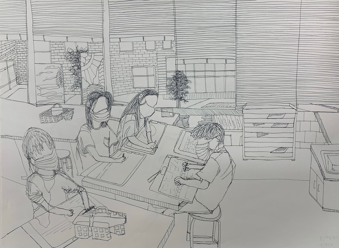 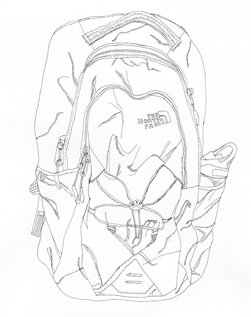 For this assignment, I practiced more with contour line and drew a backpack based off of a real life reference, not an image. I was very happy with the result of the backpack, as I could not sketch it with pencil before.
|
Archives
December 2021
Categories |


 RSS Feed
Photo used under Creative Commons from wuestenigel
