|
These photos are my three photos that represent what is happening in the world today. The first photo shows a photo I took of myself with my hands (edited in) holding polaroids of past memories. This photo represents the memories that we could be making but are missing out
on because of the pandemic. The second photo is a sign at a park that shows how the playground is closed because of COVID-19. The last photo shows a celebration for my mom’s birthday. Her friends planned a car parade because of the coronavirus. You can see how the color varies in each photo because of the way they were edited to portray a certain mode. You can see variety in these photos because while they are all related to the same theme, they all show different impacts of the pandemic. My idea behind these photos was to show how life is different with the coronavirus. The first photo shows how we miss how life was before, the second photo shows how life is changing, and the third photo shows how our community comes together as one even through difficult times. The part I find successful is how each photo is so different, but they all come together to show the same theme.
0 Comments
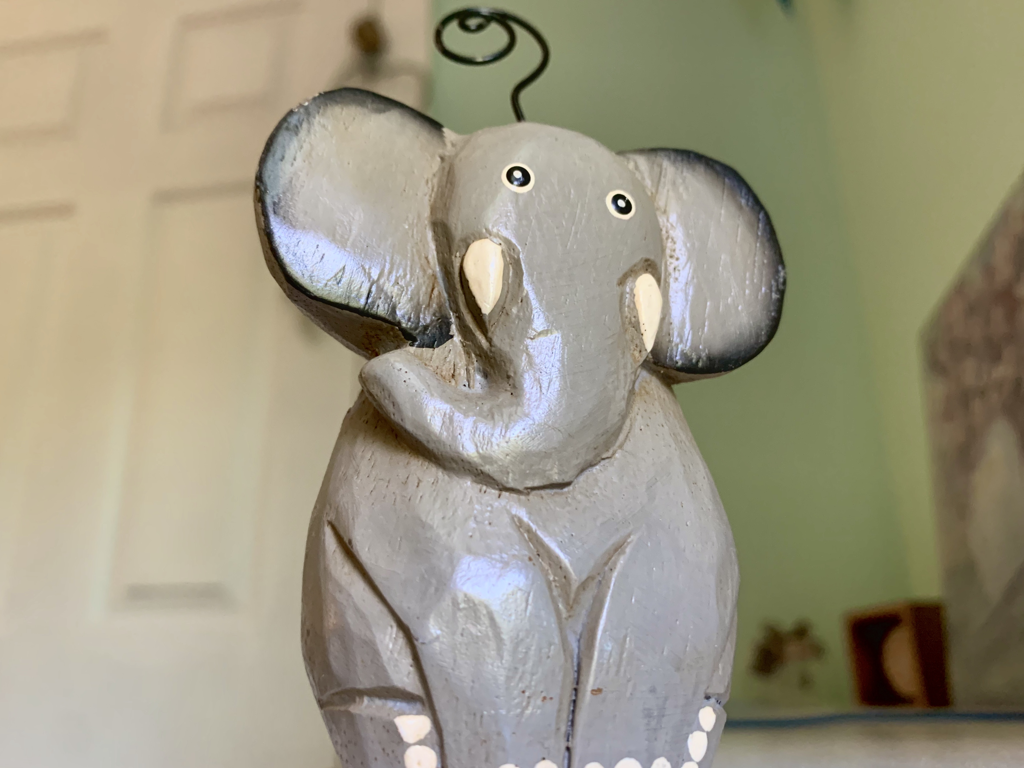 The object I decided to photograph for this warm up was a mini wooden elephant decoration from my room. You can see the wooden texture of the elephant through the highlights and shadows in the photo. You can see emphasis in this photo because of how the photo is focused on the elephant and the background is slightly blurred. The idea behind this was to show how editing a photo can show the unique features of a simple object like this elephant. What I find successful is how you can see all the details of the elephant decoration because of how the photo was taken and how it was edited. I learned from this warmup that playing around with camera angles and editing can change how you see a simple object.
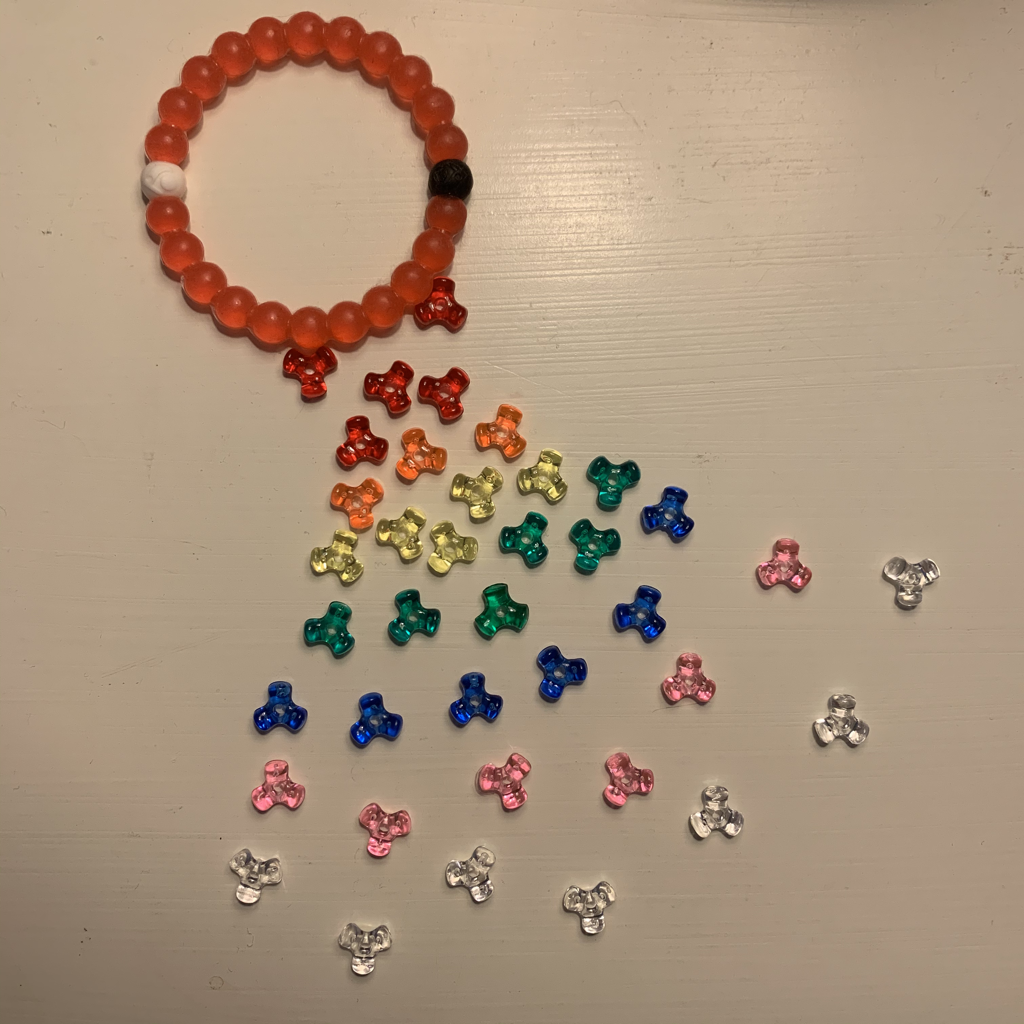 For my object arranger, I decided to use beads. I modified it from my sketch a little. I decided to use the beads to make them look like they’re coming out from the bracelet and turning into a rainbow. You can see color in this piece through the multiple color beads used throughout. You can see movement in my piece through the rays of the beads coming from the bracelet. The idea behind this piece was to make it look like the beads were radiating out from the red bracelet, and then morphing into the colors of the rainbow. The part I find successful is how the shape of the beads were all the same to create unity. The most difficult part was that I didn’t have as many variations of colors for the beads as I would’ve liked to. I learned that you can use everyday objects to be creative and make something new.
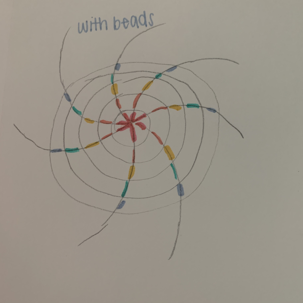 My warmup shows what I will do for my object arranger project. I decided to use different color beads and make a swirl design. You can see color in this sketch through the different color beads. You can see movement through how the beads extend from a center and radially line up with each other. My idea behind this was to use a small object that could be arranged in many cool ways. The successful part of this was finding a cool way to rearrange the beads. I learned from this that there are many different ways that you can arrange small objects to look differently.
I learned from these how to blend acrylic paints better and how to create the right shade. I learned the most from the sphere warmup because it was the most helpful for painting realistic things. This one was the most successful because it looked the best and most realistic. You can make brown by mixing any two colors that are complimentary, like green and red, or purple and yellow. To tone down a color, you can use white or opposite colors (for example, if it’s too blue, use some yellow to warm it up).     The piece I drew was a pencil portrait of one of my friends. You can see like in my piece by seeing the different types of lines in the hair and eyebrows. You can see proportion in my price with all of the features of the face. The idea behind my piece was that I had a photo of my friend that I liked a lot, so I wanted to try drawing it. The part I find most successful is how the eyebrows and eyes match up most perfectly to the original photo. The hardest part of drawing this was drawing the mouth, which I couldn’t seem to get right or match the photo. I learned that drawing portrait pictures are not what I am best at, but using certain techniques makes it easier. 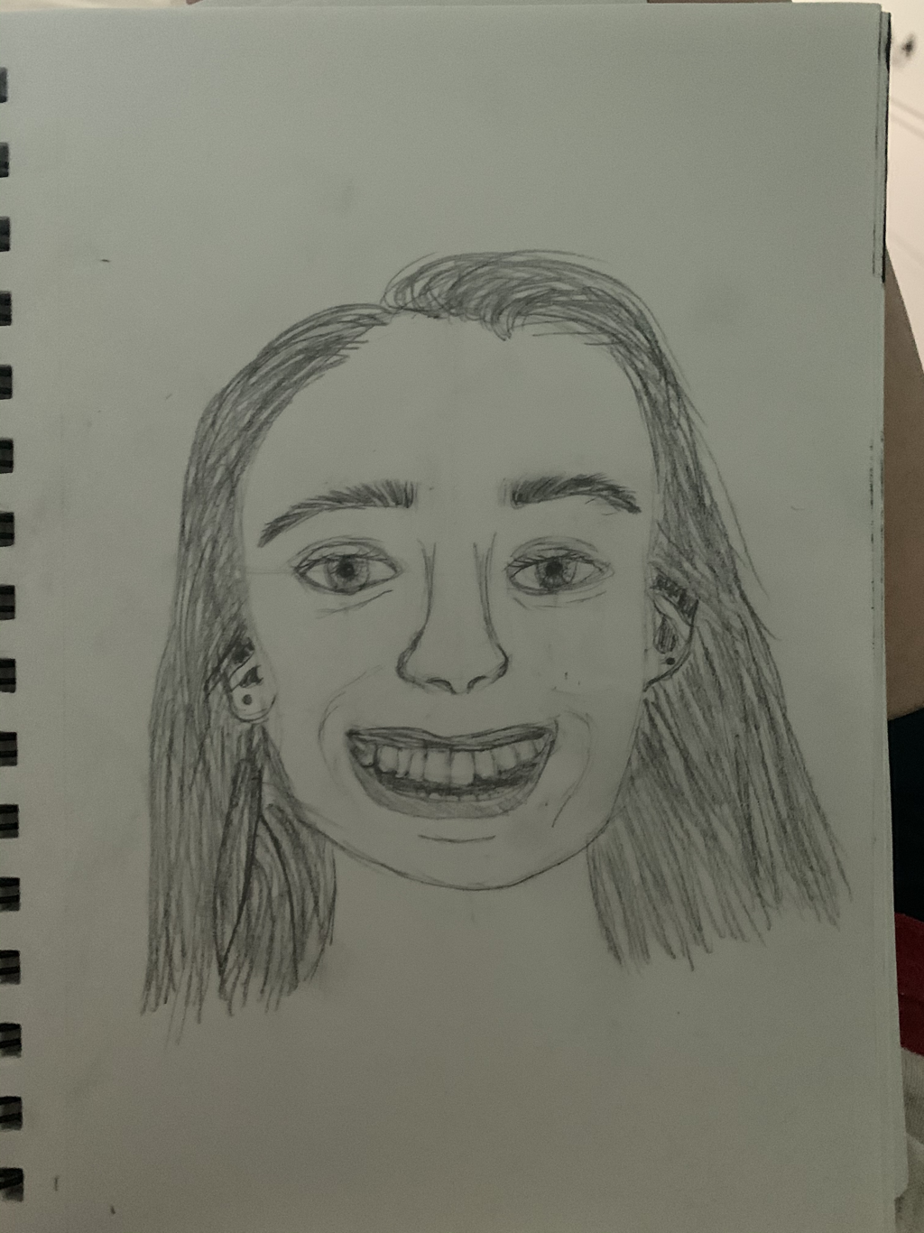    This piece is an acrylic painting of a photo taken of the Oslofjord in Norway. You can see proportion in this piece because the objects that are further away in the painting, like the trees, move farther away, they get smaller, and vice versa. You can also see line in this piece because the water creates a horizon line, as well as lines that show the water moving in one direction. The idea behind my piece was from a photo that I took when I went to Oslo, Norway. I took this picture of the Oslofjord (fjord is a Norwegian word, which is very similar to a lake). I was inspired by this picture because it reminds me of the good times that I got to spend and new things I was able to experience in Norway. The part I find most successful about my piece is the trees. I think that is the most realistic part of my painting and is was the most fun to paint. This assignment helped me learn how to paint in different ways with acrylic paint, and how certain brushes can be used in many ways.
   The most helpful warmup for me was drawing the ASL hand "A" because it helped me learn how to shade better and to use shapes to help draw realistic things. Composition is how you arrange different elements in your artwork. Value is how light or how dark a color is.
A pro of the pen drawing is that there are many different styles you can use, like hatching, stippling, and random line. A con is that stippling, which I mainly used, takes a long time. A pro of the pencil drawing is that you can easily erase your mistakes, unlike the pen drawing. A con is that it takes a lot of time to blend the pencil. A pro of the charcoal drawing is that is you can blend in your mistakes really easily. A con is that the charcoal is really messy and it is hard to show small details. Hollie Chastain Hollie Chastain is an artist based in Chattanooga Tennessee. The materials that she works with are photographs, book pages, and other types of scraps of materials to create her pieces. She began creating her art in 2008. The materials that she uses in her art are typically from the 1960’s and 70’s. Another thing that I think is interesting is that she wrote a book that explains different techniques for making art like hers. Her website is https://www.holliechastain.com. Hollie Chastain’s work draws me in because I think they way that she arranges the different materials is interesting and changes the original meaning/purpose of those materials. Her artwork is inspiring to me because it shows a way to be creative in a unique way. I also think it is inspiring because her work shows how you can make something unique and inspiring from unrelated items or items that have don’t have much of a purpose anymore.   |
